Thursday, February 28, 2013
Series 2 plan
I will be using CS5 blur effects to emphasize and censor parts of the photos that I take pictures. I'm going to try and emulate the style of photography I did in the previous series, using creative usage of censoring of sections of photos to change their feeling. Blurring particular parts of a photo is near impossible without focusing on an object that is moving at a considerable speed. Using editing I will get pictures that have an effect that is impossible to get using non-edited techniques.
Monday, February 25, 2013
Custom Series

What does censorship really do in photography? Does it block out something that that observer wants to know, or does it make the observer all the more aware of everything that goes on in the picture? I bet the observer wouldn't have noticed the fire alarm in the top left corner or the figures in the window on the right.

Our vision is obscured as a monster looms overs, yet do we really know what is under the box?

A good way to identify an object is by its size, but when it is so ordinary can you recall its scale.

Your eyes are drawn straight up the path to an unknown making it hard for the leading lines to fray into the rest of the picture.

You wouldn't think that one thing makes so much difference, but it defines this sidewalk.

When you censor, what you were trying to block only changes form.

Although you can see what is trying to be blocked, you do lose a sense of what it is.

You can see the censored object clearly, how much more pretty is it when you can see?

You see what they want.

Paranoid.
Friday, February 15, 2013
Plans for Custom Series -UPDATED

- Look for pictures that would look good with cartoon like shading. Look to use blurs. The attributes of this picture it would be very hard to replicate its effects, with objects other than moving cars.
- Negative space blocks. Through finding large blocks of color or through editing. Will be using a black box much like those of censors to create a mysterious or sometimes outrageous censoring.
- Neon colors, look for bright colors on dull backgrounds, or use editing techniques to enhance interesting pictures.
Thursday, February 7, 2013
Negative Space

The sky acts as negative space, making the picture seem much more happy with its bright colors as opposed to the gray tone you might usually see.

This picture's negative space helps to add a lot of depth to the picture, if you look at the leaves you have areas that have much denser amount of leaves. This gives the picture a more

The blue paint splatter serves as a subject for something that is flying or swimming as the little paint trail makes it seems like it is suspended.

Color of the negative space, is a real illusion to what time of day this picture was taken. The slow shutter speed makes it seem like this was taken in the evening as opposed to the middle of the day.

The negative space emphasizes the contrails greatly, through the contrasting colors.

The green vs the blue makes the people in the picture seem more vivid than they already are.

The sky really gives you a sense of scale for the city
Wednesday, January 30, 2013
Decimated Landscape

These pictures are of nature and man, the clash between them, and the beauty behind their coexistence. In this first photo, I foreshadow my style of using foreground to show the beauty of nature. The general rush of colors in the back seems chaotic, to the monotone green of the plants.

The used container looks disgusting, and I strategically placed it in the bottom left third intersection, to emphasize its invasion of the environment. Much like in the first picture I try and show the beauty of nature as opposed to the conquering of man.

The trimmed leaves of the plant looks very unnatural, being centered makes it seem like everything around it is natural. With the stem's central position they seem isolated.
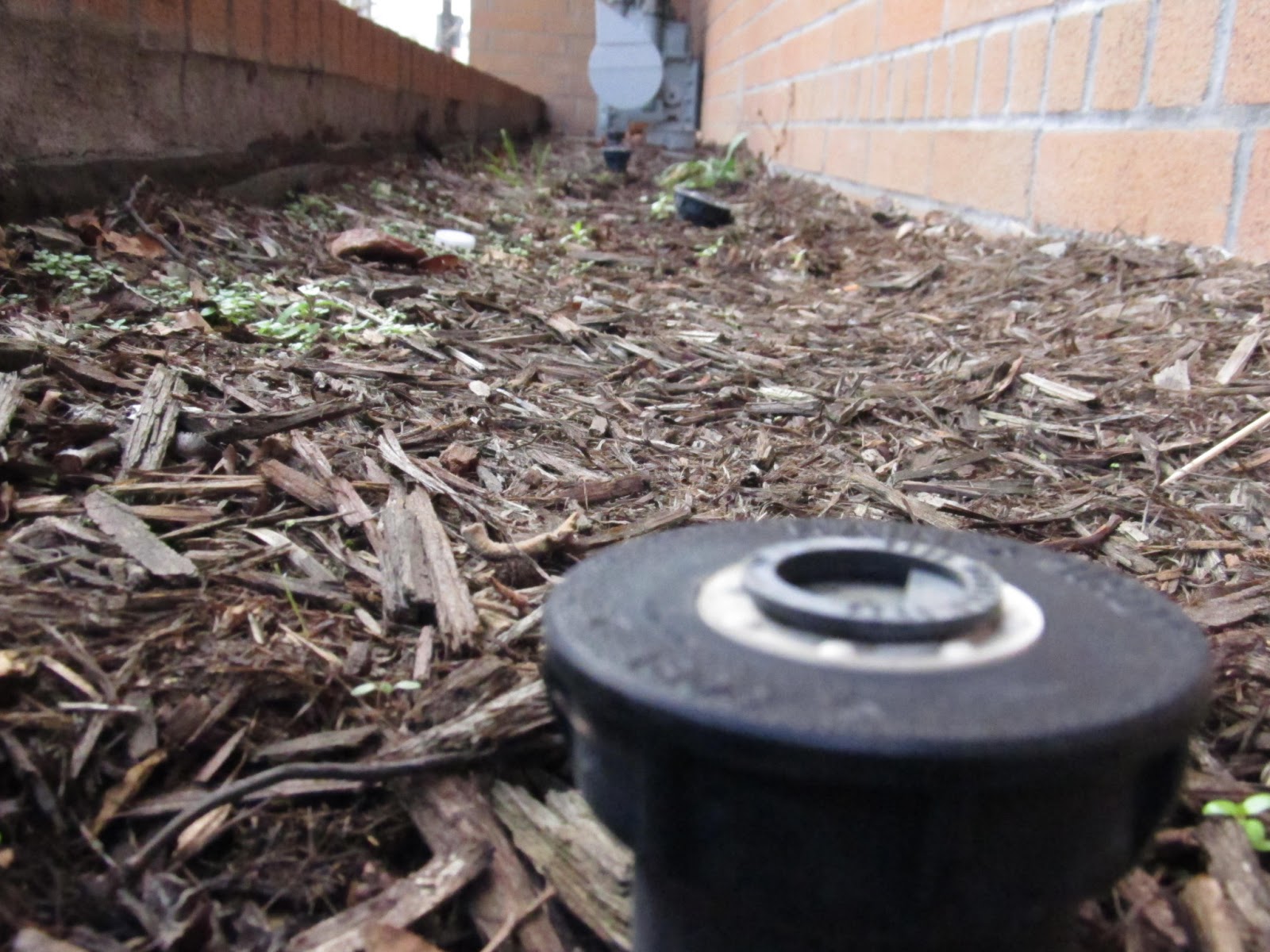
This picture differs in that there is a lack of shrubbery, which is ironic since the sprinklers should be helping the plants grow.

The tree seems peaceful compared to the blur of life behind it, again the power of foreground pictures.

A lone leaf, with the alien white colors behind it, signalling the end of a tree's livelyhood.
Friday, January 18, 2013
Annotations

This picture is less about the objects than their colors, which is why I used a very colorful object to describe them. The red, yellow, and dark blue colors remind me of the end of the day when the sun sets.

If you notice the pose of a dinosaur is very much like a person hiding, with the hunched over position and the long strides. He is doing a good job of hiding isn't he?

A lot of things can be said about this picture, but no one recognizes what is right in front of them.

This photo can be interpreted two ways the man has the power to hurt you, or he has the power to hurt himself.

The brightness of the scene on the street is interrupted by a single break in the picture. Much like the things in the dark, the words are hard to see, because they are right underneath the beggining of the leading line.

Pay attention to the placement of the bulbs, wouldn't he picture be so much more beautiful with the addition of two foreground pictures.

The leaf is trapped in between a rock and a hard place. The words are in the rock.

What place could be more desolate for a plant than a cement desert.

Why is the "Not" smaller?

How does the string ball up into a yarn ball? Only unwinding will find the answer.
Friday, December 7, 2012
Tina Modotti's Style

The lighting of the photograph gives off an emphasis on the ball of string. The ball of string represents the strength from many to create something strong.

The open bottle has a clear glean to it, drawing your eye to it. The underside of the table and the open bottle represent the discarding of things that are no longer of use to us, almost ignorant of what is under the table.

The mouse has a similar glean to that of the sickle Tina took in her photos. Much like in her photos a glean creates a sort of revolutionary, cutting-edge feeling with the object.

A fallen king, much like how Tina wanted to topple the current regime in Mexico.

An oddity among others, the reduced lighting makes the plastic bag blend in more than it sticks out.

Waste, a subject Tina would dislike very much due to her Commuinist background. The use of shadowing in the back gives an infinite feeling to the stack of bricks as you can't see where they end.

Out of place, the ball sticks out like a sore thumb with its harsh white color under a somewhat dim background. It has the same sort of striking feeling as Modotti tries to get across.

Between a rock and a hard place, the leaf is almost obscured by the brighter colors of the rocks. It represents the seemingly gigantic forces that crush individuals, something that is overlooked when studying them.
Subscribe to:
Comments (Atom)